Color contrast findings
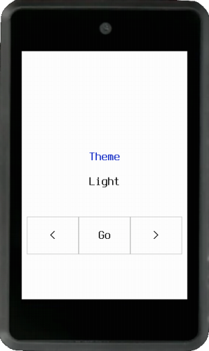
Status: Complete Failures: 10 strict pair-level failures (7 below 3:1, 3 between 3:1 and 4.5:1)
Fix preview
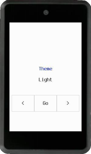
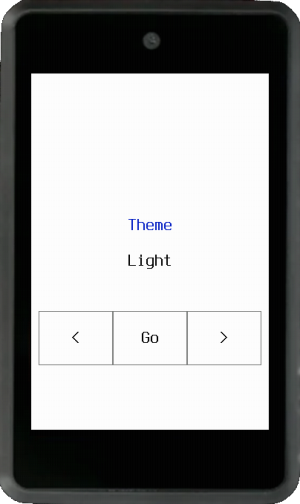
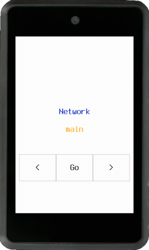
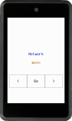
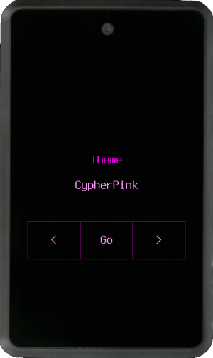
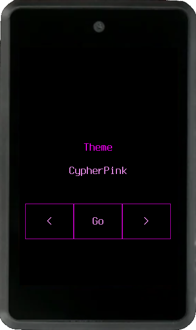
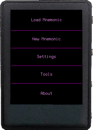
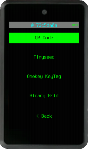
PR #879 merged the first contrast patch. It only changes color constants where the evidence is clean: Light theme frames, Light action and error colors, mainnet/testnet labels on Light, and the CypherPink frame. The CypherPink frame uses a darker magenta instead of grey, so the theme keeps its pink/purple identity while meeting the contrast target. It leaves the Amigo info-panel override alone for now. A draft that changed it tested poorly on real hardware, so that fix needs its own follow-up.
| Area | Before | After |
|---|---|---|
| Light frame / background | 1.71:1 | 4.15:1 |
| Light go / background | 2.85:1 | 4.59:1 |
| Light error / background | 4.00:1 | 6.22:1 |
| Light mainnet text / background | 1.97:1 | 4.66:1 |
| Light testnet text / background | 1.37:1 | 4.59:1 |
| CypherPink frame / background | 2.13:1 | 4.79:1 |
Light theme frames
Light theme network labels
CypherPink theme frames
Amigo info background follow-up
How this was measured
Krux stores colors as 16-bit RGB565, byte-swapped. The audit converts each value to standard RGB, computes relative luminance using the WCAG 2.1 formula, then calculates contrast ratios for every foreground/background pair that appears on screen.
The fonts are bitmap, 8-16px tall. That counts as "normal text" under WCAG, so the thresholds are:
- AA: 4.5:1 minimum (normal text)
- AAA: 7:1 minimum (normal text)
- Non-text UI components: 3:1 minimum (WCAG 1.4.11)
Only pairs where text is actually rendered against that background are
counted. Tracing draw_string() calls through the rendering code showed
that text is never drawn on a frame-colored background; it always uses
bg_color. So foreground/frame pairs in Dark, Orange, and CypherPunk
themes are visual-weight concerns (text and outlines look similar), not
WCAG text contrast violations. Both elements pass independently against
the background. Those 3 are listed as usability notes below.
For button labels (large text / UI components), the threshold is 3:1
rather than 4.5:1. esc_no and error share the same RED color.
RED/WHITE passes 3:1 for button labels, but error messages are normal
body text and need 4.5:1.
Critical failures (below 3:1)
At these ratios, the element is essentially invisible or unreadable for anyone with even mild vision impairment.
| # | Theme | Pair | Ratio | What's wrong |
|---|---|---|---|---|
| 1 | Light | frame / background | 1.71:1 | Borders invisible on white. Menu dividers, key outlines, and hint text all disappear. |
| 2 | Light | mainnet/category text / background | 1.97:1 | Mainnet text is faint on Light backgrounds. |
| 3 | Light | testnet/category text / background | 1.37:1 | Testnet text is effectively invisible on Light backgrounds. |
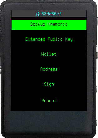
| 4 | Orange | foreground / disabled (Amigo) | 2.10:1 | Amigo info panels are below AA. Orange on grey needs a hardware check before a fix. |
| 5 | CypherPink | frame / background | 2.13:1 | Purple frame on black, nearly invisible. Dividers and key outlines gone. |
| 6 | CypherPink | foreground / disabled (Amigo) | 2.22:1 | Pink on grey. Same Amigo follow-up. |
| 7 | Light | go / background | 2.85:1 | The "confirm" button text is dark green on white. Hard to spot. |
High severity (below 4.5:1 AA threshold)
Readable with effort, but causes strain. Especially in low light or direct sunlight, both common scenarios for a handheld device.
| # | Theme | Pair | Ratio | Needed | What's wrong |
|---|---|---|---|---|---|
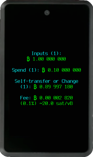
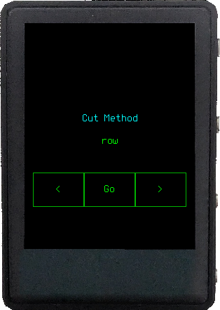
| 8 | CypherPunk | foreground / disabled (Amigo) | 3.02:1 | 4.5:1 | Green on grey info panels. You can read it, but barely. |
| 9 | Light | error / background | 4.00:1 | 4.5:1 | Red error text on white. Doesn't feel urgent. |
| 10 | Dark | foreground / disabled (Amigo) | 4.15:1 | 4.5:1 | White on grey. Closest to passing, but still under threshold. |
Usability notes (not strict WCAG failures)
These three affect visual weight separation on keypads. Text and outlines are independently visible against the background, but they look too similar to each other. This makes key boundaries harder to parse at a glance, especially on small screens.
| Theme | Foreground | Frame | FG/Frame ratio | FG/BG | Frame/BG |
|---|---|---|---|---|---|
| Dark | WHITE | GREY | 2.56:1 | 21.0:1 | 8.2:1 |
| Orange | ORANGE | DARKORANGE | 2.17:1 | 10.6:1 | 4.9:1 |
| CypherPunk | GREEN | DARKGREEN | 2.08:1 | 15.3:1 | 7.4:1 |
These are worth fixing because they hurt scannability, but they don't constitute WCAG violations since no text is rendered on a frame background.
Full scorecards
| Color pair | Ratio | AA | AAA |
|---|---|---|---|
| foreground / background | 21.00:1 | Pass | Pass |
| foreground / info_background | 10.32:1 | Pass | Pass |
| error / background | 5.25:1 | Pass | Fail |
| go / background | 15.30:1 | Pass | Pass |
| esc_no / background | 5.25:1 | Pass | Fail |
| del / background | 14.17:1 | Pass | Pass |
| highlight / background | 11.86:1 | Pass | Pass |
| toggle / background | 16.75:1 | Pass | Pass |
| disabled / background | 5.06:1 | - | - |
| frame / background | 8.21:1 | Pass | Pass |
| foreground / frame (adjacency) | 2.56:1 | Note | Note |
| foreground / disabled (Amigo) | 4.15:1 | Fail | Fail |
| Color pair | Ratio | AA | AAA |
|---|---|---|---|
| foreground / background | 21.00:1 | Pass | Pass |
| foreground / info_background | 16.39:1 | Pass | Pass |
| error / background | 4.00:1 | Fail | Fail |
| go / background | 2.85:1 | Fail | Fail |
| esc_no / background | 4.00:1 | Pass | Fail |
| del / background | 4.29:1 | Pass | Fail |
| highlight / background | 10.65:1 | Pass | Pass |
| toggle / background | 10.65:1 | Pass | Pass |
| disabled / background | 1.28:1 | - | - |
| frame / background | 1.71:1 | Fail | Fail |
| foreground / frame | 12.26:1 | Pass | Pass |
| foreground / disabled (Amigo) | 16.39:1 | Pass | Pass |
| Color pair | Ratio | AA | AAA |
|---|---|---|---|
| foreground / background | 10.63:1 | Pass | Pass |
| foreground / info_background | 5.23:1 | Pass | Fail |
| error / background | 5.25:1 | Pass | Fail |
| go / background | 15.30:1 | Pass | Pass |
| esc_no / background | 5.25:1 | Pass | Fail |
| del / background | 14.17:1 | Pass | Pass |
| highlight / background | 14.17:1 | Pass | Pass |
| toggle / background | 16.75:1 | Pass | Pass |
| disabled / background | 5.06:1 | - | - |
| frame / background | 4.90:1 | Pass | Fail |
| foreground / frame (adjacency) | 2.17:1 | Note | Note |
| foreground / disabled (Amigo) | 2.10:1 | Fail | Fail |
| Color pair | Ratio | AA | AAA |
|---|---|---|---|
| foreground / background | 11.25:1 | Pass | Pass |
| foreground / info_background | 5.53:1 | Pass | Fail |
| error / background | 5.25:1 | Pass | Fail |
| go / background | 6.70:1 | Pass | Fail |
| esc_no / background | 5.25:1 | Pass | Fail |
| del / background | 14.17:1 | Pass | Pass |
| highlight / background | 6.70:1 | Pass | Fail |
| toggle / background | 16.75:1 | Pass | Pass |
| disabled / background | 5.06:1 | - | - |
| frame / background | 2.13:1 | Fail | Fail |
| foreground / frame | 5.29:1 | Pass | Fail |
| foreground / disabled (Amigo) | 2.22:1 | Fail | Fail |
| Color pair | Ratio | AA | AAA |
|---|---|---|---|
| foreground / background | 15.30:1 | Pass | Pass |
| foreground / info_background | 7.52:1 | Pass | Pass |
| error / background | 5.25:1 | Pass | Fail |
| go / background | 15.30:1 | Pass | Pass |
| esc_no / background | 5.25:1 | Pass | Fail |
| del / background | 14.17:1 | Pass | Pass |
| highlight / background | 16.75:1 | Pass | Pass |
| toggle / background | 16.75:1 | Pass | Pass |
| disabled / background | 5.06:1 | - | - |
| frame / background | 7.37:1 | Pass | Pass |
| foreground / frame (adjacency) | 2.08:1 | Note | Note |
| foreground / disabled (Amigo) | 3.02:1 | Fail | Fail |
Network indicators
These live outside the theme system. ORANGE means mainnet, GREEN means testnet. They're hardcoded, so they need to work against every theme's background:
| Theme background | ORANGE (mainnet) | GREEN (testnet) |
|---|---|---|
| Dark (black) | 10.63:1 Pass | 15.30:1 Pass |
| Light (white) | 1.97:1 Fail | 1.37:1 Fail |
| Orange (black) | 10.63:1 Pass | 15.30:1 Pass |
| CypherPink (black) | 10.63:1 Pass | 15.30:1 Pass |
| CypherPunk (black) | 10.63:1 Pass | 15.30:1 Pass |
On Light theme, both indicators are invisible against white. This matters because mainnet vs testnet is a safety-critical distinction; if the label disappears, users lose a visual cue before signing.
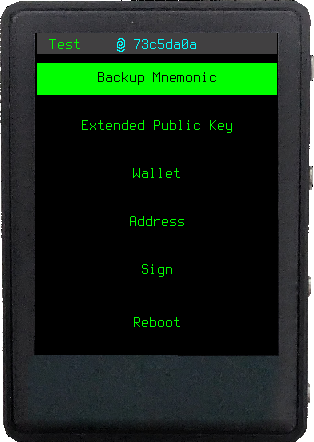
Patterns
Three structural issues:
-
The Amigo info-panel override at
themes.py:132-134fails the computed contrast check in 4 of 5 themes. A draft removed it, but real Amigo testing showed that was worse on the device. The first contrast PR leaves the override in place and keeps this as a separate hardware follow-up. -
Light theme has the most failures overall: frame, go, error, and both network indicators. This is the strongest case for a broader palette revision rather than individual color swaps.
-
The network indicator problem is unique because it's hardcoded outside the theme system entirely. A theme-level fix won't help here; the indicator colors themselves need to change, or they need a background pill/outline.
Color reference
RGB values computed from the byte-swapped RGB565 constants in
src/krux/themes.py:
| Name | RGB | Luminance |
|---|---|---|
| BLACK | (0, 0, 0) | 0.000 |
| LIGHTBLACK | (65, 64, 65) | 0.052 |
| DARKGREY | (123, 125, 123) | 0.203 |
| GREY | (164, 161, 164) | 0.361 |
| LIGHTGREY | (197, 198, 197) | 0.563 |
| DARKWHITE | (230, 226, 230) | 0.769 |
| WHITE | (255, 255, 255) | 1.000 |
| GREEN | (0, 255, 0) | 0.715 |
| DARKGREEN | (0, 178, 0) | 0.318 |
| RED | (255, 0, 0) | 0.213 |
| LIGHT_PINK | (255, 153, 255) | 0.513 |
| PINK | (255, 0, 255) | 0.285 |
| PURPLE | (123, 0, 123) | 0.056 |
| ORANGE | (255, 165, 0) | 0.482 |
| DARKORANGE | (205, 85, 0) | 0.195 |
| YELLOW | (246, 210, 41) | 0.659 |
| BLUE | (0, 28, 197) | 0.049 |
| LIGHTBLUE | (8, 214, 238) | 0.543 |
| CYAN | (0, 255, 255) | 0.787 |