Layout consistency findings
Status: Complete
The short version
Layout is the healthiest of the four axes. The reserved-region system holds up, nothing overlaps or clips in the captured flows, and the core spacing constants are sensible. The audit found zero critical and zero high issues.
The remaining problems are consistency debt: six findings, two medium and four low. None of them break a screen today. They are the kind of thing that can cause drift over time, especially when a new device gets added to the lineup.
That is a useful result on its own. Layout does not need the same structural rework as contrast. It needs tightening.
Evidence review
The layout findings were reviewed against the current source and annotated screenshots. The review did not change the severity ratings. L1 through L6 still look correct, and no new high or critical layout issue appeared.
The published layout screenshots were also compared against the local annotated evidence. They match byte-for-byte, so the existing images stay in place.
One correction still matters: the QR-camera progress-bar finding is code evidence only for now. An earlier screenshot reference for that flow was not actually present in the captured screenshot set. The finding still stands because the per-device pixel table is in the source, but visual evidence is not attached yet.
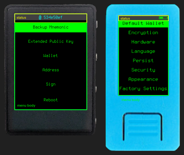
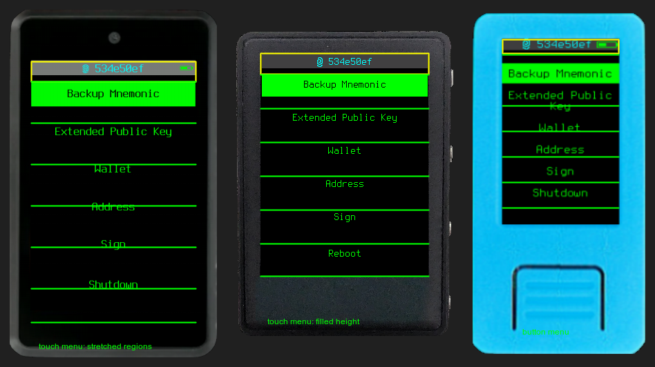
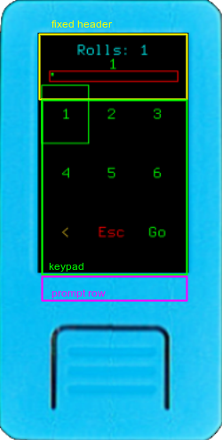
What was reviewed
Spacing, alignment, and reserved regions across screens and the three device tiers. The reserved regions are the status bar at top and the prompt area at bottom. Padding comes from two constants, 10px standard and 5px minimal. The review checked whether screens use those constants consistently or reach for hardcoded numbers, and whether a layout that balances on TZT still works on the smaller M5StickV and the larger Amigo.
The review also checked whether the methodology was classifying findings correctly. The important distinction is between a layout failure and layout maintainability debt. A failure would be overlap, clipping, or a device tier where the screen becomes hard to use. This audit did not find that. The current findings are mainly hardcoded offsets, duplicated centering math, and divergent layout algorithms that could cause future drift.
Findings
| # | What | Severity |
|---|---|---|
| L1 | A progress bar is positioned with a hardcoded per-device pixel table instead of being derived from screen height like everything else | Medium |
| L2 | Two bottom-of-screen offsets use unexplained magic numbers instead of the existing layout constants | Low |
| L3 | A vertical-centering helper exists but is bypassed. It is used in 3 page-level places; raw midpoint math appears in 34 page locations | Low |
| L4 | Touch menus and button menus use two separate layout algorithms with different spacing. The same menu doesn't measure the same across device types | Medium |
| L5 | A device-specific padding branch sits inside an otherwise device-agnostic drawing routine | Low |
| L6 | Keypads reserve a fixed three-line header that doesn't adapt, which squeezes the key cells on the smallest screen | Low |
The two mediums are the ones worth attention. L1 because hardcoded per-device pixels are exactly what breaks when hardware changes, and L4 because the split menu logic also means touch targets have no guaranteed minimum size. That second point feeds straight into the navigation axis.
One thing that looked like a bug but wasn't
The Stackbit backup screens use different spacing for the import view and the export view. At first that looked like an inconsistency to fix. It isn't. The manual entry screen uses taller grid cells on purpose, to give a bigger touch target. That's a good accommodation, not a defect. Worth the few minutes it took to confirm before flagging it.
How it was evaluated
- Pulled the layout constants from the display code
- Checked how individual pages position content against those constants
- Cross-referenced with the 354 screenshots already captured
- Compared the published layout images against the local annotated evidence
- Flagged where the same job gets done in inconsistent ways
Severity criteria
- FAIL: Elements overlap reserved regions, or spacing is visibly broken
- FLAG: Padding differs between screens in the same flow, or a layout that works on one tier breaks on another
- PASS: Spacing uniform, regions respected, proportions hold